Understanding the Role of Icons in Design
Icons are powerful visual elements that play an essential role in design, serving as representations of objects, concepts, or actions. Rather than relying solely on text to convey meaning, designers utilize icons to enhance user experience and communication. Icons can be found across various platforms, from websites and mobile applications to print media, and are essential tools for effective visual storytelling. This article delves deep into the significance of icons in design, their applications, and best practices for utilizing them effectively.
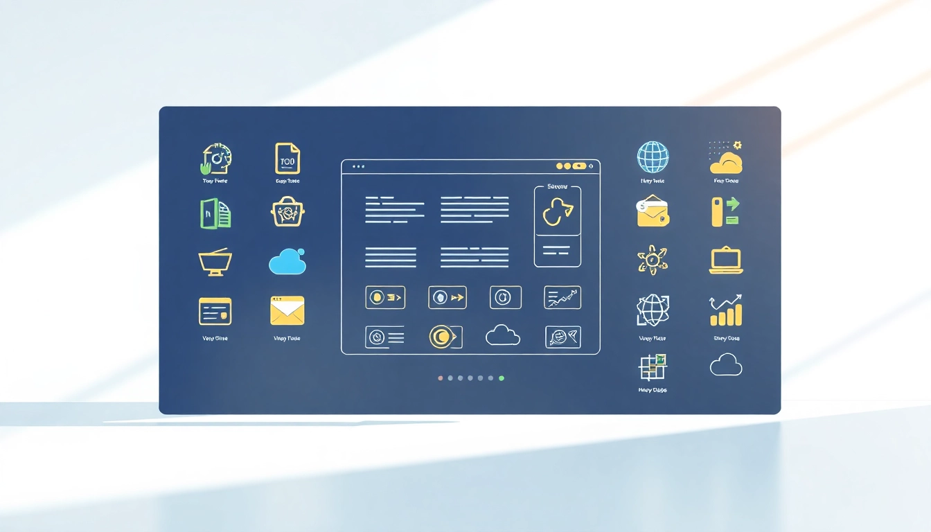
Definitions and Types of Icons
Icons come in a variety of forms, which can be broadly categorized into several types. Understanding these classifications is crucial for selecting the right icons for your projects:
- Symbolic Icons: These are direct representations of a concept; for instance, a magnifying glass symbolizes search functionality.
- Informational Icons: Typically used to provide further context or details, such as icons that represent specific types of files.
- Functional Icons: Icons that are used to illustrate actions, such as a trash can for delete functions or a pencil for edit options.
- Decorative Icons: While they may not have a specific functional purpose, these icons enhance aesthetic appeal and visual branding.
- Brand Icons: These are specific to organizations and represent brand identity, often characterized by logos and trademarked symbols.
The Importance of Icons in User Experience
Effective user experience (UX) design hinges on clear communication. Icons simplify navigation, as they can convey complex messages at a glance. Research suggests that users are more likely to engage with digital interfaces that integrate intuitive iconography:
- Speed of Comprehension: People process images faster than text, making icons an effective way to convey essential information quickly.
- Visual Appeal: Well-designed icons enhance the aesthetic quality of a digital interface, contributing to a pleasurable user experience.
- Cross-Cultural Understanding: Icons can transcend language barriers, allowing non-native speakers or individuals from diverse backgrounds to navigate content effectively.
How Icons Enhance Visual Communication
Icons serve as a bridge between text and images, allowing for more dynamic communication. By condensing information into a simple visual, they create a more compelling narrative. Here’s how they contribute to visual communication:
- Create Focus: Icons draw attention to specific actions or features, helping direct users’ eyes to the most important parts of a page.
- Provide Context: When paired with text, icons can reinforce the message through visual association, making information easier to understand.
- Encourage Engagement: Well-placed and visually appealing icons can entice users to interact, such as clicking on buttons or exploring new content.
Choosing the Right Icons for Your Projects
Factors to Consider When Selecting Icons
Selecting the appropriate icons for your project involves several considerations:
- Clarity and Relevance: Icons should clearly communicate their intended function or meaning without ambiguity.
- Consistency: Maintain a uniform style throughout your design to enhance recognition and establish a cohesive visual language.
- Size and Scalability: Icons need to be legible at various sizes; ensure they’re designed with scalability in mind.
- Color and Contrast: Consider how color affects visibility; high contrast will help the icons stand out while enhancing readability.
- Brand Alignment: Icons should align with your brand’s visual identity, employing similar colors and styles to enhance brand recognition.
Where to Find Quality Icons
Finding authentic and high-quality icons is crucial for effective design. Here are several reputable sources to obtain icons:
- Icon Libraries: Websites that specialize in icon resources often offer extensive libraries suited for different design needs.
- Creative Marketplaces: Independent designers sell icon packs through platforms that support creative work.
- Open Source Repositories: Many open-source platforms provide free icons that can be used across various projects.
Free vs. Paid Icons: Making the Right Choice
Deciding between free and paid icon options involves examining several aspects:
- Quality: Paid icons often come with a higher design quality and versatility, adhering to specific production standards.
- Licensing Issues: It’s essential to understand the licensing agreements associated with free icons, as some require attribution or limit commercial use.
- Customization: Premium icon collections frequently offer editable files, enabling personalized modifications to align with design objectives.
Design Principles for Effective Icon Usage
Maintaining Consistency Across Icons
Consistency is paramount in icon design. It ensures that your icons work harmoniously, resulting in a more cohesive visual experience. Here are several principles to maintain consistency:
- Unified Style: Icons should share a similar design language, whether minimalist, outlined, filled, or a combination thereof.
- Complementary Colors: Use a consistent color palette that aligns with your overall brand identity to create a visually unified aesthetic.
- Uniform Sizes: Consider standardizing the size of icons to maintain visual balance and clarity across your platforms.
Creating Custom Icons: Tips and Tricks
Custom icons can be a powerful way to differentiate your brand while enhancing user experience. Here are some tips for creating your own icons:
- Sketch First: Start with sketches to explore various concepts, ensuring the design adheres to the relevant message and audience.
- Use Design Software: Utilize vector graphic software to create icons that can be scaled without losing quality.
- Solicit Feedback: Share your designs with a focus group or colleagues to gauge effectiveness and clarity before finalizing.
Best Practices for Color and Size
Choosing the right color and size is critical for the efficacy of icons. Follow these best practices:
- Adaptive Sizes: Use responsive design principles to ensure icons scale effectively on various devices, catering to different screen sizes.
- Color Psychology: Be mindful of the emotions associated with colors; use colors that resonate positively with your target audience.
- Contrast and Visibility: Ensure that icons have enough contrast against backgrounds for easy identification, especially for accessibility purposes.
Implementing Icons in Different Media
Using Icons in Web Design for Better Navigation
Web design benefits immensely from the thoughtful integration of icons, especially in navigation:
- Menu Icons: Implement recognizable icons for menu items to simplify navigation for users.
- Call-to-Action Buttons: Icons can be used alongside text in buttons to reinforce the expected action, such as an envelope for email sign-ups.
- Visual Cues: Use icons to highlight key information spots, such as help sections or frequently asked questions.
Icons in Print Media: Design Considerations
In print media, icons also serve important roles:
- Visual Hierarchy: Icons can define sections within brochures or flyers, establishing clear navigation paths for readers.
- Brand Recognition: Utilize icons that reflect your brand’s personality to reinforce identity even in printed formats.
- Emphasis on Key Information: Incorporating icons can draw attention to critical information within a printed layout.
Integrating Icons into Mobile Applications
Mobile apps benefit from concise and clear icon usage due to limited screen space:
- Tab Bar Icons: Use icons in tab bars for seamless navigation; they should be intuitive to enable efficient app usage.
- Interactive Elements: Incorporate icons representing actions such as a camera, chat, or settings for easier engagement.
- Notification Icons: Consider unique icons for in-app notifications, helping users quickly identify alerts at a glance.
Measuring the Impact of Icons in Your Designs
Analyzing User Engagement Metrics
Evaluation of icons’ effectiveness requires analyzing user engagement metrics:
- Click-Through Rates: Measure the performance of clickable icons in calls-to-action to determine their effectiveness in driving user engagement.
- User Feedback: Solicit feedback directly from users concerning the clarity and appeal of your icons through surveys or usability testing.
- Heat Maps: Use heat maps to visualize where users are interacting within your interface, shedding light on which icons attract the most attention.
Tools for Testing Icon Effectiveness
Several tools can assist in testing the effectiveness of your icons:
- A/B Testing Software: Utilize these tools to compare different icon designs and track variations in user behavior.
- Analytics Platforms: Leverage analytics to dissect user interaction data, identifying trends and patterns related to icon usage.
- User Testing Platforms: Enlist services that allow you to observe real-time interactions with your icons, gathering qualitative feedback.
Case Studies: Success Stories with Icons
The effectiveness of icons has been demonstrated through various successful design implementations:
- Case Study 1: An e-commerce platform improved its cart abandonment rate by incorporating intuitive icons to enhance user navigation during the checkout process.
- Case Study 2: A social media app enhanced user engagement metrics through the use of unique, visually appealing icons for its features, resulting in increased activity among users.
- Case Study 3: A non-profit organization improved its informational flyer’s effectiveness by using custom icons that represent its initiatives, enhancing the overall visual appeal and clarity of the message.